
Role
UX Designer | UI Designer | Information Architect
Tools
Sketch, Adobe Illustrator, Whimsical.io, pencil and paper, and lots of post-its
Duration
6 Weeks
Overview
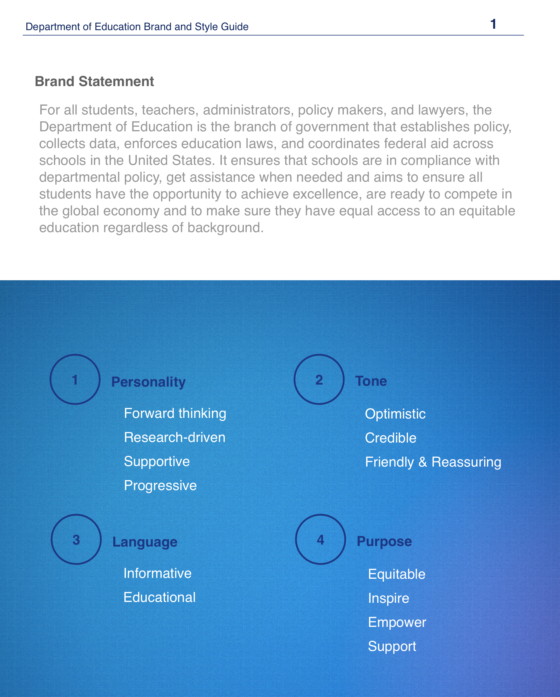
For all students, teachers, administrators, policy makers, and legal professionals, the Department of Education is the branch of government that establishes policy, collects data, enforces education laws, and coordinates federal aid across schools in the United States.
It ensures that schools are in compliance with departmental policy, receive assistance as necessary and aims to ensure all students have the opportunity to achieve excellence, are ready to compete in the global economy and to make sure they have access to an equitable education regardless of their personal background.
The DOE is a government branch that establishes the policies and regulations to ensure that the children of America can be competitive in an increasingly global economy.
The Current Website
Desktop
Tablet/iPad
Mobile
Current Website Issues
After speaking to teachers and students, I have discovered the following issues on the current website:
The navigation bar options and the card links are redundant
There are a lot of text blocks, which look overwhelming and boring
It is hard to navigate the site and find desired pages
Unnecessary links are given priority on the homepage and there is no clear pattern for hierarchy
The overall look of the website is outdated and unattractive
The logo does not completely reflect the brand voice of DOE
The brand of DOE is not clearly reflected in the website
Features, Functionality, Benefits, and Priority
I have created a chart to sort the features needed for the website using Google spreadsheets. This chart shows the features that users will be viewing when they visit the site, the functionality of each feature, the benefits of having each feature in the website, and priority of building each feature.
Logo Redesign

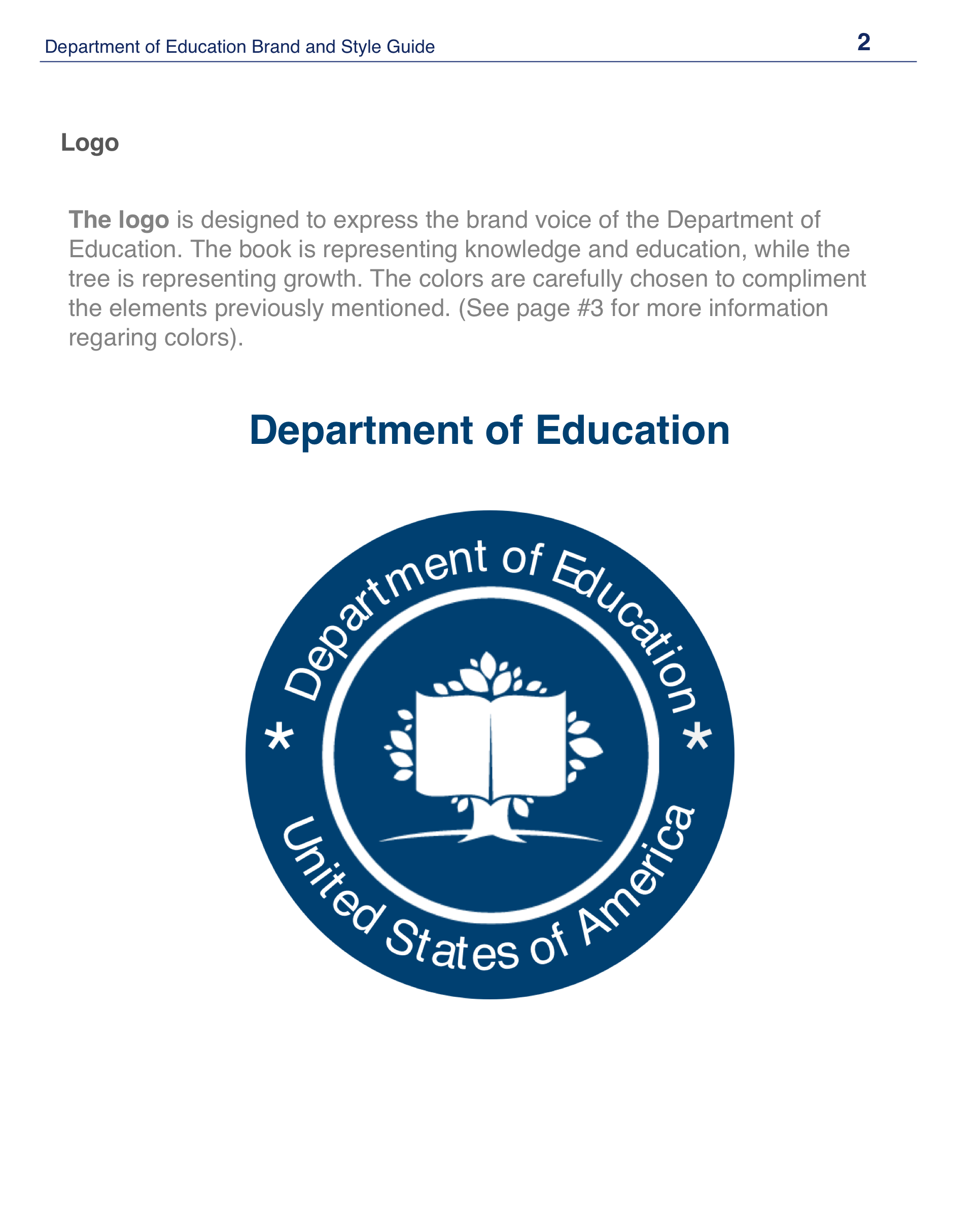
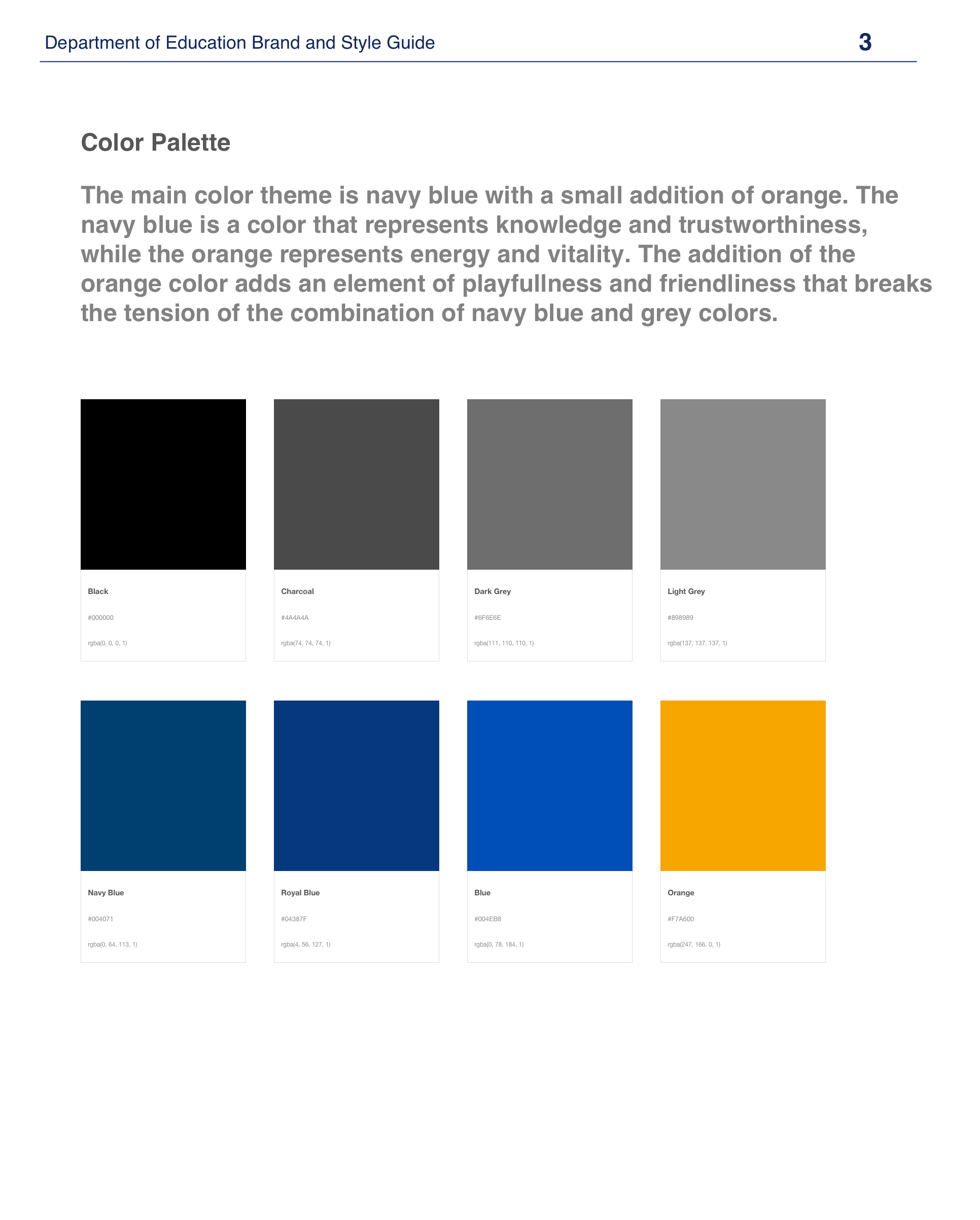
Although it is not the official DOE logo, the photo on the left is displayed on the website as the logo of the website. It clearly does not reflect the brand voice. The logo on the right is designed to express the brand voice of the Department of Education. The book is representing knowledge and education, while the tree is representing growth. The colors are carefully chosen to compliment personality, tone, language, and purpose of the website. The navy blue is a color that represents knowledge and trustworthiness.
Digital Wireframes
Styleguide
High Fidelity Mockups
I have created the website to be responsive and usable on web, tablet, and mobile. I have used the 70-20-10 color theory rule and chose to use more of white space to decrease tension and to better organize the website.
Reflections
I believe that UI and UX are inseparable. While UX is crucial for user retention rate, UI is critical for user attraction; especially first timers. working on rebranding and redesigning the DOE website, I was mostly focused on the UI and the organization of the website. From talking to potential website visitors, they were repulsed and overwhelmed that they had given up long before they find their desired page.